Innovation Without Fragmentation

A practical guide for designers and engineers to building better products together, without compromising coherence

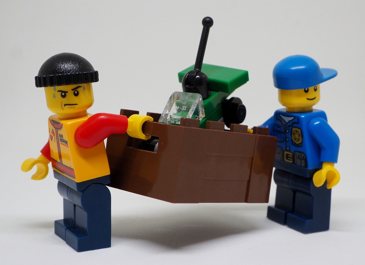
Cover Image: Two Lego Figures Carrying Tools, Working Together

Image by flockine from Pixabay

As Lead Product Designer, one of the most nuanced aspects of my role isn’t just designing interfaces, it’s managing relationships. Especially the dynamic, sometimes tense relationship between designers and engineers when it comes to balancing innovation with a cohesive user experience.

Let me start by saying this: I love working with engineers who are excited about trying new tools and pushing boundaries. That energy is essential to building modern, resilient, and delightful products.

Additionally, as designers, we can sometimes get too caught up in discussions of consistency and adhering to established patterns, even in the cases where breaking them (while maintaining overall platform feel) is the best option for the user experience. Steve Krug tells us

Clarity trumps consistency. If you can make something significantly clearer by making it slightly inconsistent, choose in favor of clarity.
(Steve Krug, Don't Make Me Think, p. 547)

But I’ve also seen how unchecked innovation, especially when it sidesteps design intent, can lead to the introduction of usability problems. We need to be proactive in creating channels where innovation can happen while maintaining the integrity of a shared product vision and without undermining the user experience.

Normalizing Design–Engineering Tension

Tension between design and engineering is not a red flag. In fact, it’s often a sign of investment. Engineers want to craft smart, elegant solutions just as much as designers want to shape intuitive, beautiful experiences.

But problems arise when innovation becomes improvisation. When an engineer decides to “improve” a component mid-implementation without talking to design, it might seem like a harmless optimization. But zoom out, and you’ll often find those small tweaks snowballing into platform-level fragmentation.

Establish Lines of Communication

I know, I know. Communication—who's surprised? But it's true that innovation often goes rogue when there’s a gap in understanding. Engineers may not know the rationale behind a design choice, and designers may be unaware of technical opportunities or constraints.

We can hold regular touchpointswhere engineers are invited to critique design, not just implement it. This builds trust and gives them space to propose creative solutions early—before code is written. We do this during our weekly syncs.

Informal Slack culture also matters. Creating a space where an engineer can drop a “hey, I’m thinking about trying X for this nav component” without it feeling like a confrontation can go a long way. Transparency should be low-friction. This can come naturally to a lot of people, but some teammates may need to be encouraged. I always try to let devs know they can drop me a line if they have any questions or ideas.

Make Design Intent Explicit

Designers often carry context in their heads, but we can’t expect engineers to protect the integrity of a design system if we don’t make our intentions legible. I'm definitely guilty of this, especially when I'm working to deliver designs quickly or working within very established systems. And sometimes the team doesn't have a culture of delivering intention.

It's easy to get into the flow of creating designs and handing them off with only design specs. But we can document rationale where appropriate and make space for context during those regular touchpoints. Why this component? Why this interaction? What user problem is it solving?

A shared design language (visual and philosophical) gives everyone working on the project something to align with. It’s easier to say “this change breaks our established pattern” than “this just looks off.”

Create Space for Sanctioned Innovation

People go rogue when they don’t feel heard. So instead of resisting innovation, we can create structured paths for it.

We could, for instance, create a “propose a pattern” process where engineers and designers can jointly pitch a new UI solution before it ships. This could be as simple as a shared doc and a 15-minute review. Leadership can also encourage engineers to build and test new interaction patterns in a low-risk innovation zones. These are great moments to explore new tools or ideas without the pressure of shipping immediately.

And for new components, it's crucial to maintain a cross-functional review processfor proposed new patterns or UI elements. This prevents “one-offs” from spreading unvetted across the app. And when deviations do happen, we can track them.

Be Honest About Innovation’s Tradeoffs

Sometimes, what seems like innovation is really just novelty. A slick animation library might delight an engineer to implement, but does it improve user comprehension? Increase accessibility? Reduce cognitive load? If the answer is no, then it’s not innovation—it’s noise.

Even worse, these changes often introduce subtle inconsistencies that scale badly. Suddenly, dropdowns behave differently in three different places. Users notice. PMs notice. And maintenance debt climbs.

Innovation is only valuable if it serves user and business needs, and preserves platform coherence.

Shared Ownership, Shared Vision

Designers don’t “own” quality. Engineers don’t “own” innovation. We’re co-owners of a user experience that spans pixels, performance, and platform logic. When we treat each other as partners in that mission, creating space for tension and trust, we build better products.
So let’s keep the doors open, keep the principles close, and keep our systems coherent. Because the best innovation doesn’t break the system, it evolves it.

Start Small, Start Now: Building a Usability Testing Process

How I helped build a usability culture from scratch and why you can too

When I was hired as a product designer at Wisetail, one of the first things I was asked to do was build a usability testing process. It was a priority for the role. At the time, the team hadn't done much usability testing—not even informally. The challenge was equal parts intimidating and exciting.

At a previous job, I’d relied on guerrilla testing—quick, scrappy sessions that offered valuable insights even without formal structure. Those early experiences showed me just how much clarity and momentum usability testing could bring to a project. So when the opportunity came to start a formal process from scratch, I understood its importance and I felt ready. I also felt confident I could get a process on paper and buy-in from stakeholders. And a big part of that confidence came from Steve Krug.

Demystifying Usability Testing

Krug's "Don't Make Me Think" has been helping designers and anyone involved in making digital products understand usability since it was first published in 2000. There’s a common mental hurdle around usability testing: the assumption that it’s complicated, expensive, and best left to specialists. But Krug demystifies usability testing in a way that makes it feel approachable, even fun.

He reminds us that testing doesn’t have to be a massive, budget-heavy operation to be effective. You can learn an incredible amount just by watching one person try to use the thing you're making, at any stage in the process. He makes the case, with humor and clarity, that small, frequent tests are not just possible—they’re often better.

That simplicity was key in getting my team and stakeholders on board. Once people saw that usability testing could be fast, lightweight, and immediately insightful, they were more than willing to try. And once they saw a real person struggle with something we thought was intuitive? That’s when they became believers.

From Ground Zero to a Real Process

I started by building the basics—a reusable template for observer instructions and participant tasks, a simple test script, and a lightweight recruiting process. We ran sessions monthly to start, recording everything and inviting team members to observe and take notes. Each session ended with a collaborative debrief, where we surfaced key findings and translated them into next steps.

Those debriefs turned out to be one of the most powerful parts of the process. They created shared understanding, fueled iteration, and helped everyone—regardless of role—feel connected to the user experience.

Over time, our process matured. We worked out timing, solidified scripts, streamlined scheduling, and invited broader participation. EVen client-facing team members got involved. Usability testing went from a design initiative to a cross-functional habit.

Now, three years later, we’re running consistent usability sessions across multiple projects twice a month. The process is collaborative, adaptable, and embedded in how we work. Product managers know how it works and have been able to facilitate them. And the process continues to improve because team members feel empowered to contribute ideas and take ownership.

Why Usability Testing Matters

It’s easy to think we can design flawless experiences just by being thoughtful. But no amount of best practices or expertise can replace watching someone actually try to use your product. Usability testing is awesome, specifically because it:

  • Reveals the gap between intention and experience
  • Helps prioritize what really matters to users
  • Speeds up iteration and reduces risk
  • Builds team-wide empathy and alignment

Even brief sessions can uncover moments of confusion or frustration that aren’t obvious in design files. And once you see those, you can’t unsee them—which makes the product better, faster.

What I Learned Along the Way

1. Facilitation is a learned skill.

In the beginning, I leaned heavily on scripts and was a little rigid. But over time, I learned to be present, listen actively, and respond to what was happening in the moment. A good facilitator makes space for discovery without leading participants too much.

2. Testing is only valuable if you talk about it.

Running a session is one thing—but debriefing is where the real value shows up. Those conversations are where insight turns into action. They also create shared language across teams and foster alignment.

3. Trust is everything, especially with client-facing teams.

When testing with real clients, trust is crucial. These teams need to know that the testing process won’t embarrass them or damage relationships. I worked hard to communicate our goals clearly, respect the context, and demonstrate how testing improves client outcomes. That trust took time to build, but it made the entire process stronger.

You Don’t Need a Perfect Plan

If you’re thinking about starting usability testing but feeling overwhelmed, here’s the truth: you don’t need a perfect system. You don’t need a lab. You don’t need a full research team. You just need to start.

Start with one person. One test. One honest debrief. Then do it again. And again. That’s how culture changes. That’s how products get better. That’s how teams build empathy and alignment around what really matters: making things that work for the people they’re meant to serve.

Designing Meaning

How UX designers shape the human experience of technology and why that matters more than ever

Cover Image: A mechanical hand and a human hand reach toward each other with a blue sky and pink clouds in the background

Image by TyliJura from Pixabay

As Product and UX/UI designers, we’re often told we’re the voice of the user. But in reality, we’re something stranger and more precarious: translators in an ongoing negotiation between technology and the people using it.

We take system architecture and turn it into interactions. We take business requirements and turn them into flows. We turn edge cases into moments of empathy—designing for the exceptions to build trust for everyone. This work is deeply interpretive and communicative.

Making the Complex Legible

In her book "Spurious Coin: A History of Science, Management, and Technical Writing", Bernadette Longo tells the story of a hidden class of communicators who shaped the machinery of science and management not by inventing new technologies, but by making them understandable. She writes about technical writers—often with liberal arts backgrounds—who straddled the worlds of industry and academia, engineering and language.

Their work translated the technical into the communicable. And for that, they were treated with suspicion.

Technical writers, Longo argues, were seen as producing “spurious currency”—fake knowledge that threatened the purity of science. Because they weren’t the inventors, engineers, or scientists themselves, their mediation of knowledge was considered less valuable—even dangerous. But their writing made systems legible. Their documentation made operations run. Their language made the technology usable.

In the same way, designers translate complex systems into human-centered experiences—crafting the interfaces, language, and flows that make technology not just functional, but comprehensible and usable in the real world.

What Product Design Actually Does

In an age where AI shapes decisions, software replaces human processes, and products are shipped faster than people can understand them, design isn’t a luxury. It’s a safeguard. It’s a system of checks and balances. It’s the place where ambiguity gets addressed before it becomes risk.

Design work often happens before anything is built and long after it's shipped. We identify where a system might fail, confuse, or exclude—not just in usability testing, but in the questions we ask at kickoff and the decisions we capture in specs. We advocate not only for the end user, but for coherence across cross-functional teams. Design creates shared understanding that guides decision-making, reduces misalignment, and helps teams move forward with clarity and intent.

Our documentation, prototypes, design specs, and Figma files don’t just support engineering—they mediate meaning. We explain what things are, how they work, and why they matter. And that’s not an afterthought. That’s product strategy.

The Borderlands Between Technology & Meaning

Product designers live at the borders. Between engineering constraints and human context. Between data abstraction and user emotion. Between what the system does and what it means to someone using it at 11PM on their phone.

These borders are where friction happens. But they’re also where value is created. If we understand design not just as decoration but as epistemology—a way of making knowledge visible—we can begin to reclaim the full weight of what this work means.

In a time when technology is accelerating beyond most people’s ability to parse it, the role of UX design is not just to make things easier—but to make them knowable. As digital systems increasingly mediate everything from healthcare to finance to how we communicate, the human experience of those systems becomes an ethical and cultural concern, not just a usability one. UX design is where the abstract becomes actionable, where complexity meets care. Our responsibility isn’t just to the user—it’s to the integrity of the interaction itself.

When we design interfaces, we're making the digital world interpretable. We’re shaping how it gets understood, trusted, and used. And if that makes our work seem spurious to those chasing velocity, maybe we should remind them: Every coin has two sides. Ours is the one that speaks.

Works Cited

Longo, B. (2000). Spurious coin: A history of science, management, and technical writing. State University of New York Press.

Are Designers Authors?

Why UX/UI work is authored—even when no name is attached

You probably know that Picasso painted Guernica or that The Great Gatsby was written by F. Scott Fitzgerald. But what about the billboard you pass every day on your commute, or the Help page you relied on to fix a bug in your favorite app? Who designed those? Who wrote those words?

Chances are, you have no idea.

And that’s not your fault. Unlike novels or paintings, most of the work designers and technical communicators create isn’t attached to a visible name. It’s often published under the umbrella of a company, product, or brand. And because of that, the people who craft those experiences—designers, writers, researchers—are frequently treated as functionally invisible.

But just because we’re not named as authors doesn’t mean we aren’t shaping meaning in powerful ways.

The Myth of Objectivity

In fields like product design, UX, and technical communication, there’s a long-standing assumption that our job is to be neutral and objective. The idea has been that good design “speaks for itself,” and that the designer’s hand should be invisible. But as Slack, Miller, and Doak argue in "The Technical Communicator as Author", this mindset can be misleading—and even harmful.

When we pretend the creator doesn’t exist, we deny the reality that all communication is authored by someone, and that authorship carries ethical weight.

Meaning Is Always Made

To create something—even a Help page or a data visualization—is to be involved in articulating meaning. The choices we make around tone, framing, structure, and emphasis aren’t neutral. They shape interpretation. They influence behavior. They determine whether someone feels included or excluded, heard or dismissed, empowered or confused.

So when we distance ourselves from authorship, we’re not achieving objectivity—we’re giving up accountability. Slack et al. put it this way:

“…because professional communicators contribute to the process of articulating meaning, whether they choose to or not, they must be able to analyze critically the ethical implications of the meanings they contribute to.”

That line has stuck with me. As someone who works in product design, I know how easy it is to slip into the rhythm of production—knocking out user flows, specs, presentations—without stopping to ask: What values am I embedding in this? Whose perspective is being prioritized? What impact could this have?

Owning Our Role

This doesn’t mean we need to agonize over every detail or that ethical clarity is always straightforward. But it does mean we should own our role in shaping the final product—and recognize that invisibility isn't neutrality. It's abdication.

Whether we’re writing interface copy, designing charts, or mapping out content architecture, we are not machines. We are not outside observers. We’re participants—creators—whose work influences how information is understood and acted upon.

So even when I’m not publicly credited, I remind myself: I am an author. I may not get a byline, but I still bear responsibility. And that awareness helps me do better work—more intentional, more thoughtful, and, ultimately, more human.

Works Cited

Slack, J.D, Miller, D.J, & Doak, J. (1993). The Technical Communicator as Author. Journal of Business and Technical Communication, Vol. 7, 13-36.

What UX Designers Can Learn from Science Communication

And why data and charts aren’t as neutral as we think

When we think of science, we tend to think of objectivity. Data. Facts. Charts and graphs that speak for themselves. But as Anne R. Richards points out in her article "Argument and Authority", that perception is more illusion than reality.

In "Argument and Authority in the Visual Representations of Science", Anne R. Richards unpacks how visuals—especially in scientific communication—are often presented as neutral truths when they’re actually shaped by layers of rhetoric, culture, and authority. And that matters, especially for designers, writers, and technical communicators who work at the intersection of information and interpretation.

The Illusion of Neutrality in Science and Design

Think about the dashboards we design, the reports we visualize, the onboarding flows we craft. All of these contain rhetorical choices, even if they’re subtle: what we prioritize, how we frame the problem, which numbers we show in bold, and which we tuck behind a “See More” link. These decisions affect how users understand and trust information—and they’re anything but neutral.

Richards writes:

"Visual representations appearing in contemporary scientific journals…are usually based on inscriptions produced by apparatuses serving and immured in the culture of science, yet it is the rare viewer of these representations who reminds himself that what he sees “are not ‘natural objects’ independent of cultural processes and literary forms”. (p. 185)

In other words, we often forget that these images—no matter how precise—aren’t direct reflections of reality. They’re representations, framed by choices: what to include, what to highlight, what to leave out. Over time, those representations solidify into belief. The drawing of a T-Rex becomes the T-Rex.

Visuals as Arguments: Science, Rhetoric, and Representation

This isn't a call to question the integrity of science, but rather a reminder that scientific texts and visuals aren’t immune to rhetoric. They have authors. They make arguments. And they use design—intentional or not—to persuade.

The same applies when we create a funnel visualization in a product analytics tool, or display performance metrics on a dashboard. The interface becomes a kind of truth—but it’s still a constructed one.

One of the most fascinating examples Richards offers is the idea of “nature faking”—when photographs aren’t enough to support a point, so illustrators lean into more “persuasive” visuals. Think of those hyper-detailed, idealized wildlife drawings in textbooks. Or data tables that are placed on separate pages to project credibility, giving the impression of transparency, even if the data is too dense to interpret without help.

It’s not about deception—it’s about persuasion. It’s the same impulse that leads us to add human faces to charts or craft a “success story” from data that could be interpreted in multiple ways.

This isn’t inherently unethical. In fact, these rhetorical choices are often made to help readers understand complex ideas more clearly. But what Richards warns against is the invisibility of that rhetoric—when designers (and users) forget that choices are being made at all.

Toward a More Transparent UX Practice

When our work is seen as functionally invisible—when we’re expected to deliver “clean,” “unbiased” interfaces—we risk giving up accountability for the arguments our designs are actually making. And worse, we contribute to the myth that product experiences are neutral, when in reality they reflect decisions, tradeoffs, and assumptions made by teams of people.

We don’t need to slap disclaimers on every dashboard or data chart we design. But we can be more intentional about how we represent information—and more transparent about the assumptions behind our choices. We can invite users to explore, rather than simply consume. We can make room for interpretation, rather than forcing a singular takeaway. And we can talk more openly, within our teams and organizations, about the rhetorical nature of UX design.

Because ultimately, good design isn’t about pretending to be invisible. It’s about owning our role in shaping meaning.

Richards ends her piece with a call to empower readers to “exercise logic freely” (p. 203). I’d argue UX designers should do the same—for ourselves, and for our users. Let’s stop pretending our work is just the surface, and start acknowledging it as a powerful layer of communication, persuasion, and yes, even rhetoric.

Works Cited

Richards, A. R. (2003). Argument and Authority in the Visual Representations of Science. Technical Communication Quaterly, 183-206.

The Visuals We Trust

What a powerful critique of data visualization taught me about designing with empathy

Cover Image: Shape of a human head made up of what appears to be tangled twine unraveling. The image conveys absorbing and making sense of complex data.

Photo by Google DeepMind

In the world of product and information design, we often talk about clarity, precision, and efficiency. But there’s another layer that deserves just as much attention—ethics. As designers, we regularly face decisions where we have to balance what our clients want with what our users need. It’s a delicate tension—and one that forces us to ask: Who are we really designing for?

This question isn’t just theoretical. It threads through the practical decisions we make every day—how we structure information, what we choose to highlight or leave out, and how we frame meaning. Technical communicators, including visual designers, aren’t just neutral conduits for information—we actively shape meaning. That means we also carry a responsibility to examine the ethical implications of the visuals and messages we create.

The Impact of “Cruel Pies”

“Cruel Pies” by Dragga and Voss is a powerful critique of how emotionally sterile data visualizations can be. Their argument is simple but potent: by removing human context from visuals, we risk turning real people into faceless statistics. One line in particular stood out to me:

“True, the pictographs are statistically redundant...but they are not emotionally redundant.”

Looking back, I realize I’ve sometimes designed with an unspoken assumption that users already understand the full context. For instance, I’ve created infographics that focus on delivering numbers quickly—without necessarily considering how those numbers affect real lives. I wasn’t being careless, but I also wasn’t being fully conscious of the ethical weight behind those choices. It’s easy to slip into the habit of designing for clarity and speed, especially under tight deadlines. But in doing so, we can unintentionally strip away the human dimension that makes our work truly meaningful.

What “Cruel Pies” made me confront is this: visuals don’t just show facts—they frame them. And when placed in a context of authority, they often get interpreted as objective truth. Think about how we imagine dinosaurs today—our mental images are based on speculative, but powerfully persuasive, visual reconstructions. In the same way, any graph or chart we create is never just data. It’s always a story, shaped by decisions we’ve made—intentionally or not.

Designing With Intention

This doesn’t mean every chart needs to include a crying face or a moral disclaimer. But it does mean we need to design with awareness and empathy. Ethical design doesn’t have to be a burden—it can actually be a source of empowerment. It reminds us that we’re not just technicians—we’re storytellers, shaping how people understand the world.

As someone working in product design, I’ve learned that the push for “effective” communication must be balanced with a commitment to meaningful communication. That means keeping human-centered ethics on par with accuracy and efficiency. It's not always easy—there are deadlines, stakeholders, and business goals to meet. But I want to stay mindful of what I’ve learned: to design not just for function, but with intention.

Because at the end of the day, behind every data point, there’s a human story worth honoring.

Works Cited

Dragga, S., & Voss, D. (2001). Cruel Pies: The Inhumanity of Technical Illustrations. Technical Communication, 265-274.

Kimball, M. A., & Hawkins, A. R. (2008). Document Design: A Guide for Technical Communicators. Boston; New York: Bedford/ St. Martin's.

Seeing like a Designer

How visual thinking taught me to lead with intention in UX

Cover Image: Busy abstract scene of what appears to be a hallway featuring bright primary colors, different shapes, and an arrow at the center on the bottom pointing forward. The image conveys navigating a visually dense scene.

Photo by Google DeepMind

When I was learning to draw as a kid, I was fascinated by how artists could take what they saw—both in the world and in their minds—and translate it onto a flat surface. The ability to transform perception into form seemed like magic.

But drawing well required more than observation. I had to retrain myself to see the world not as a series of familiar objects, but as compositions of light, shape, and space. I couldn’t just see a tree—I had to notice the weight of its shadow, the texture of its bark, the way its branches curved into negative space.

This shift in perception laid the foundation for how I approach product design today. Good design starts with learning how to see.

Visual Thinking as a Design Practice

In user experience design, we often talk about empathy, usability, and clarity. But at its core, UX is about understanding how people perceive and interact with the environments we create—whether those environments are physical spaces, digital interfaces, or entire product ecosystems.

Much like drawing, UX design requires you to dissect what’s intuitive and invisible, to understand how individual parts come together to shape meaning. That could mean mapping a user’s decision flow through a checkout process or it could mean noticing how the color of a button influences trust.

When I first began studying design rhetoric—the idea that visual design communicates meaning much like language does—I realized how little attention I had paid to the way my surroundings influenced my behavior. But design is always doing this. It's nudging us, guiding us, sometimes confusing or even misleading us. And often, it's invisible until you stop and look closely.

Even simple moments—like how guests at a party always end up in the kitchen—are reminders that the space itself shapes behavior.

Design isn't passive.

From Intuition to Intention

As designers, especially those shaping product strategy, our role is to illuminate these cues and use them intentionally. We are not just making interfaces—we’re crafting experiences that speak, that persuade, that guide. That’s the difference between good design and great design: intentionality.

Great design leadership comes from cultivating this awareness and teaching it to others. It’s about helping teams move beyond intuition into intention—developing a shared language for how visual elements influence cognition, emotion, and action.

This is why visual thinking is not a passive observation but an active process of problem-solving. When we design a user flow, a dashboard, or a call to action, we are engaged in a dialogue with the user. And that dialogue is visual, spatial, and deeply contextual. Every color, every margin, every flow is part of a conversation with the user. We have to know what we’re saying.

And that’s where design leadership comes in—not just to manage roadmaps and velocity, but to foster a deeper awareness of how perception shapes experience.

Design Is a Dialogue

Visual thinking isn’t only an artistic skill. It’s a form of problem-solving—a way of making sense of the world by organizing it. When we design, we’re engaging in a dialogue. The interface speaks, and the user responds. Our responsibility is to make sure that message is intentional, inclusive, and legible.

When we zoom out from pixels and patterns and instead consider how design shapes perception, we step into our most powerful role: that of a communicator and strategist.

Because the most effective design isn’t just beautiful or functional—it’s legible. It’s persuasive. It’s empathetic. And above all, it sees the user not just as a persona on a slide deck, but as a person navigating meaning through a world we help construct.

Applying Information Design in Unlikely Places

What clinical research questionnaires reveal about the real cost of poor information design

When researchers at the H. Lee Moffitt Cancer Center set out to improve the way they collected patient data for their Breast Cancer Lymphatic Mapping Database, they discovered something simple but powerful: better design makes a real difference.

In a study comparing two versions of a clinical questionnaire—one created by a systems analyst and another crafted using information design principles and usability testing—they found that the thoughtfully designed form gathered significantly more complete data.

But the story isn’t just about better forms. It’s also about the real-world challenges that information designers face—navigating software limitations, balancing user needs with design best practices, and often having to explain the value of their work to people who don’t fully understand it. This study highlights those tensions, especially in complex fields like medicine, where the impact of poor design can ripple far beyond usability. The authors candidly note that they often had to

“compromise among the needs of the users, the general design guidelines, and the constraints of the software” (p. 183).

That struck a chord. We should keep in mind that even the most thoughtful design choices can sometimes seem futile or even irrelevant to clients who don’t share our lens. And that’s a challenge worth unpacking.

Why Clients Don’t Always “Get” Design

One of the most valuable takeaways from this study was the reminder that our clients may see our work as pedantic or unnecessary—not because they don’t care, but because they’re coming from a different perspective. That tension is common, especially when we try to apply information design principles in industries where those practices aren’t the norm.

But instead of feeling frustrated or dismissed, we can shift our approach. Rather than defending our choices based on personal preference, we should aim to explain how these design principles actually serve the client’s goals—and their users.

As technical communicators, we’re often “cursed” with expert knowledge. It becomes hard to imagine how someone wouldn’t see the value in clean, user-centered documentation. But for many clients, especially in highly specialized fields, that value isn’t self-evident. And sometimes, design decisions come up against deeply ingrained norms or regulatory systems that weren’t built with usability in mind.

The High Stakes of Design in Unfamiliar Fields

Clinical research is one such field. Zimmerman and Schultz’s article focuses on how poorly designed questionnaires impact the accuracy of medical data. That’s a pretty high-stakes issue—far beyond a frustrating user interface or a confusing form field.

Anyone who’s filled out a medical questionnaire knows how frustrating (and often overwhelming) they can be. And yet, this difficulty is so common that many patients accept it as just another part of navigating healthcare. But as technical communicators, we should be asking: Why aren’t these designed better?

The authors point to a deeper problem:

“There is a gap between research and practice in document design… much of the research is conducted in widely disparate fields” (p. 178).

In other words, the people who create these forms often lack training in information design. And it’s not just a matter of making forms easier to fill out—these design issues have real ethical consequences.

Design as an Ethical Responsibility

As Zimmerman and Schultz emphasize, design decisions in this context go beyond usability:

“The success of the design used in this study should be considered in terms of its potential to add to patients’ overall personal healthcare and raises an ethical question about the practice of making broad generalizations regarding healthcare based on incomplete data” (p. 192).

That statement really hit home. Not every designer will be confronted with ethical stakes this high. But it’s a powerful reminder that how we structure information can have real-world consequences—especially when others are relying on that information to make decisions that affect people’s health and wellbeing.

Becoming Empathetic Advocates for Design

At the end of the day, our role isn’t just about making things look good or work better—it’s about advocating for clear, human-centered communication, even when the value isn’t immediately obvious to others.

We may not have medical expertise or the same professional lens as our clients, but we do bring something valuable to the table. It’s our job to bridge that gap—to explain, with empathy and clarity, how good design can benefit users, clients, and in some cases, entire systems.

The work can be hard, and the compromises are real. But when we center our practice on collaboration and understanding, we help build a world where thoughtful communication design is not just appreciated—but expected.

Works Cited

Zimmerman, B. & Schultz, J. (2000). A Study of the effectiveness of information design principles applied to clinical research questionnaires. Technical Communication, (Second Quarter, 2000). 177-194.